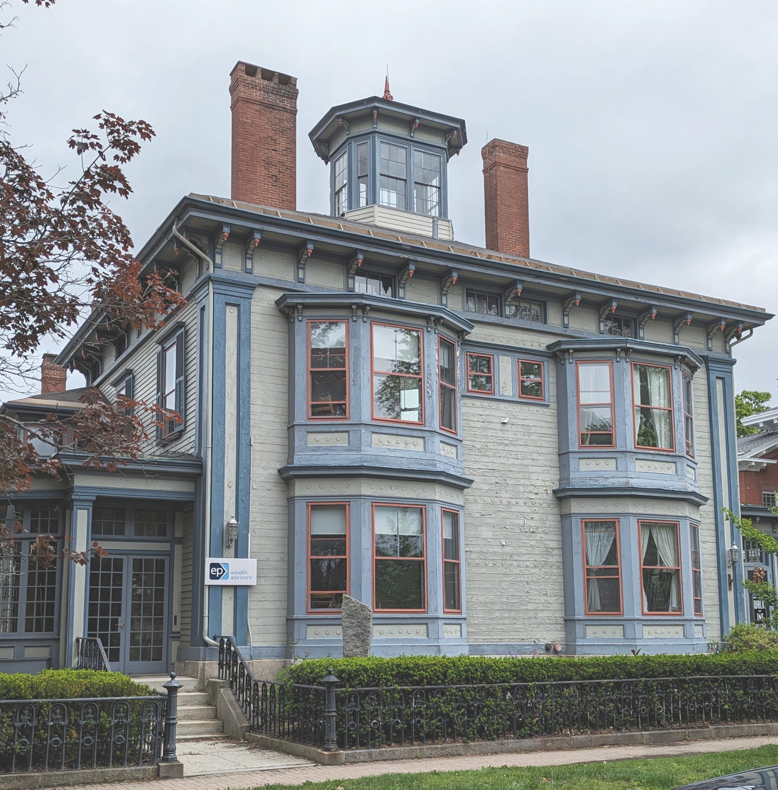
Man Made: A Building Built for Authority (Now Selling Trust)
This is the kind of structure that was never meant to be invisible. It isn’t a “nice old house.” It’s an urban statement piece—a high-status residence from the late 19th / early 20th century that’s doing what good architecture always does: communicating power, competence, and permanence before you ever step inside.
1) Massing and Street Presence
The building reads as a solid rectangular block that’s been animated with projection and height. The core mass is heavy, and then the architect breaks it up using two major moves:
- Stacked bay windows (two floors) that push toward the street
- A strong horizontal roofline that caps the whole composition
That combo creates a “forward posture.” It leans into public view. That matters—because this was likely designed for a person who wanted their house to have civic weight.
For a wealth advisory today: same trick, new product.
The building says: we are established, we are stable, we are not going anywhere.
2) The Bays: Light, View, and Social Display
Those two bay stacks aren’t just decoration. Bays were expensive, and they do three things at once:
- increase interior space without enlarging the footprint much
- pull in light from multiple angles
- create a “stage” window—where occupants and furnishings are visible to the street
That last part is subtle but real. In the original era, bays were part utility and part social signaling. They said: we live well enough to design rooms around light and public presentation.
3) Roofline as Craft Showcase
Under the eaves you’ve got a whole procession of:
- deep overhangs
- decorative brackets / modillions
- panel-like trim fields between structural elements
This is a hallmark of late Victorian / early transitional styles: the roofline becomes a place to show off carpentry. You’re not just buying shelter—you’re buying skilled labor made visible.
That’s also why these buildings adapt so well to professional use: the detailing reads as “quality” even to people who can’t name the parts.
4) The Lantern: A Belvedere as Brand
The octagonal rooftop lantern (cupola/belvedere) is the crown.
Historically, it’s tied to:
- ventilation and daylight
- views over the neighborhood
- status—because it’s extra structure for non-essential space
Architecturally, it does something key: it adds a vertical “signature” so the building is recognizable at a distance. That is exactly what a modern firm wants too.
A wealth advisory needs to sell an invisible product: judgement, stewardship, trust.
A building like this materializes trust.
5) Chimneys: Functional Monuments
The two tall brick chimneys are honest old-world infrastructure. They’re also pure symbolism now:
- brick = permanence
- height = presence
- symmetry-ish placement = controlled power
Even people who don’t care about architecture read chimneys like that as “old money / old stability.”
6) Palette and Trim: The Building as a Designed Object
This isn’t a passive paint job. The palette is doing design work:
- muted wall color keeps the mass calm
- blue trim articulates structure and edges
- red window sash frames act like punctuation
It’s an unusually assertive combination, and it turns the building into an object you remember. That matters for a business: it’s easier to say “the place in the big bay-window building with the tower.”
7) Why This Works as a Wealth Advisory Office
Adaptive reuse here is almost perfect because the building already has the right psychological cues:
- Residential scale feels personal and discreet
- Historic detailing implies care, longevity, and seriousness
- Prominent street posture implies credibility
- Bays and large windows create bright, comfortable offices and meeting rooms
- The iron fence/hedges reinforce a controlled boundary: welcome, but private
So the building now performs a kind of translation:
old domestic authority → modern professional trust