A House That Knows It’s on the Corner
Corner houses carry responsibility.
They do not get to disappear into a row. They do not get to hide behind repetition. They face two streets, two streams of light, two directions of wind and foot traffic. They are seen in motion, not just in passing.
This one understands that.
From the first glance, it reads as high style—not ostentatious, not theatrical—but confident. The tower rises just enough to claim the intersection. The cornice projects with intention. The brick holds color like it means it. There is composure here.
You can feel the moment in which it was built—when corners were considered opportunities, not problems to be solved cheaply. When the skyline of a neighborhood mattered at the scale of a single roofline. When ornament was not apology, but punctuation.
The angled tower doesn’t merely decorate the house. It absorbs the geometry of the intersection. It softens the right angle of the grid. It turns the block from something rigid into something conversational.
And in doing so, it carries the weight of the street.
There is something generous about that. A house willing to perform a little. To hold the corner steady. To give the passerby a detail to study, a shadow line to follow, a roof shape to remember.
This is manmade in the best sense of the word—brick stacked with care, trim cut with pride, a structure built not just to contain life but to contribute to the rhythm of a city.
Before we talk about cornices and massing and stylistic lineage, it’s worth pausing here:
Some houses simply occupy space.
This one shapes it.
Corner Composition: A Study in Late-19th-Century Urban Confidence
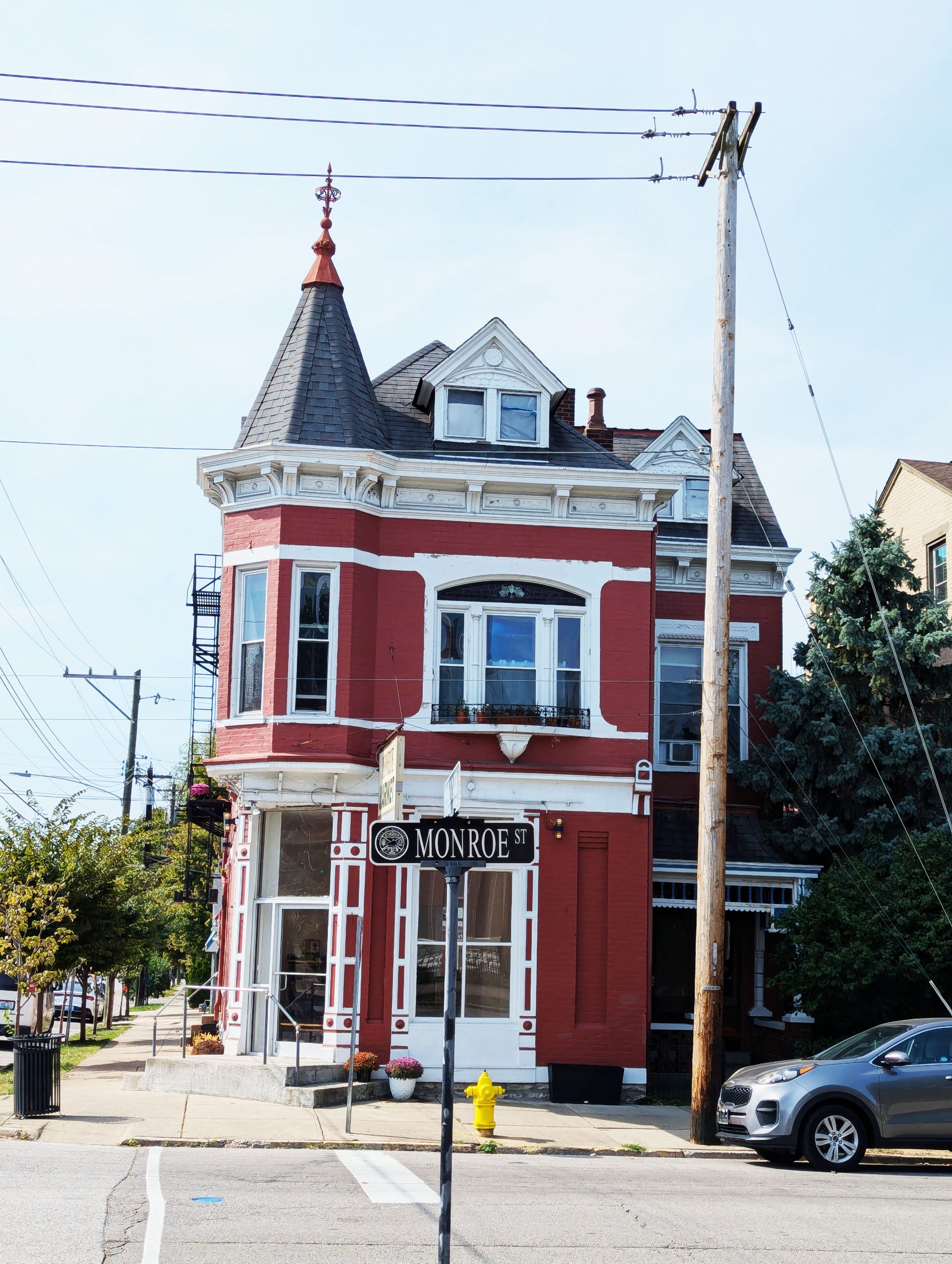
On a compact urban lot at the intersection of Monroe Street, this late-19th-century brick residence demonstrates a disciplined response to one of the most difficult residential conditions: the corner.
Rather than presenting two flat elevations, the structure resolves the intersection with a projecting, faceted tower capped by a conical roof. The move is neither whimsical nor excessive. It is compositional. The tower mediates between street grids, absorbs visual momentum, and establishes vertical emphasis within an otherwise rectilinear block.
This is not ornament for ornament’s sake. It is geometry deployed with intent.
Massing and Proportion
The building’s massing is compact and efficient—three vertical tiers capped by a pronounced cornice. Horizontal articulation is achieved through belt courses and strong trim delineation between levels. The painted masonry—brick in a deep oxide red with high-contrast white trim—amplifies the tectonic logic rather than obscuring it.
The proportions are restrained. Window openings are tall and vertically aligned. Sills and lintels are expressed rather than flattened. The cornice employs corbels and dentils with disciplined repetition, producing shadow depth without excess.
Unlike speculative contemporary infill, this facade understands scale. Each decorative element is sized relative to the pedestrian vantage point.
The Corner as Opportunity
Corner parcels introduce complexity: dual exposures, asymmetrical setbacks, and competing sightlines. Many structures retreat into compromise.
Here, the tower becomes the hinge. Its angled faces absorb the intersection’s visual force, transforming what could have been a blunt edge into a calibrated pivot. The result is a facade that reads dynamically from multiple approaches.
From one axis, the house presents as a vertical townhouse with Italianate influences—bracketed cornice, elongated windows, ornamental window hoods. From another, it reads closer to Queen Anne urban vernacular through its tower articulation and varied roofline.
The hybridity is typical of the 1880–1900 transitional period, when stylistic purity often yielded to compositional pragmatism.
Detail and Craft
The transom glazing incorporates patterned glass—an economical yet effective means of introducing ornament at the threshold. Window crowns display molded relief work, modest in scale but precise in execution. Brick courses are consistent; mortar joints remain legible.
Importantly, the facade is masonry in substance, not surface. The depth of window reveals confirms structural brick rather than contemporary veneer.
The raised entry creates a subtle datum shift between sidewalk and interior plane. Three steps elevate the threshold just enough to confer privacy while maintaining street engagement.
This is urban architecture calibrated to human scale.
Contextual Continuity
The adjacent buildings reinforce the reading of a cohesive streetscape. Three-story brick volumes with prominent cornices define a consistent skyline. Variations in color and maintenance are secondary to the structural grammar shared across the block.
Such continuity is not accidental. It reflects a period in which builders operated within a shared proportional vocabulary. Window rhythms align. Cornice heights correspond. Lot widths remain disciplined.
The street reads as a collective composition rather than a series of isolated objects.
Infrastructure and Time
Overhead utility lines traverse the sky. A contemporary hydrant occupies the curb. A modern vehicle sits at the edge of frame.
These elements are not degradations. They are layers.
The building persists not as preserved artifact but as functioning infrastructure within a living city. Its continued occupation confirms its success as architecture rather than nostalgia.
Conclusion
This residence demonstrates how modest urban housing once balanced economy, ornament, and structural clarity without theatricality.
Its corner tower resolves geometry.
Its cornice anchors proportion.
Its masonry conveys permanence.
It neither overstates nor retreats.
In an era of flat facades and applied detail, this structure stands as evidence that urban density and architectural intention were once mutually reinforcing.
It remains so.