There is no reason this house should be this charming.
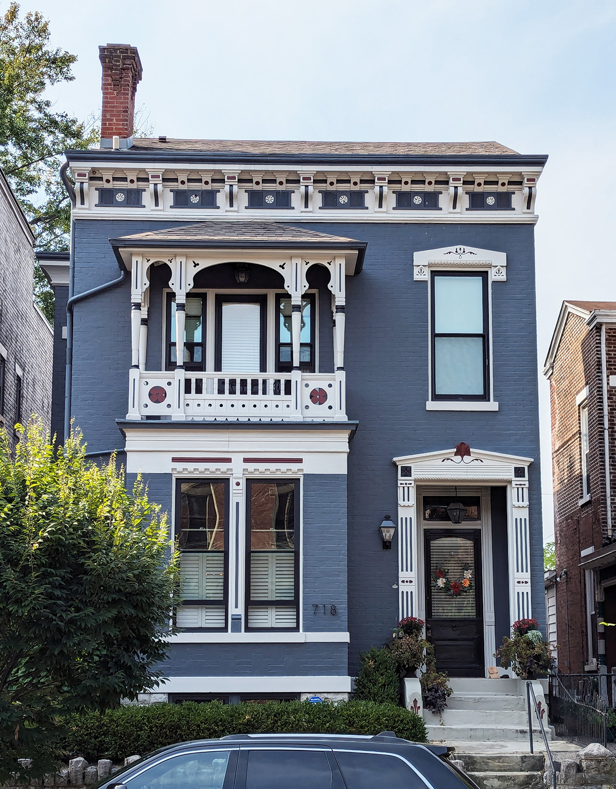
At its core, it is a narrow-fronted brick box. Two full stories, a flat-faced urban facade, a side-hall entry, a straightforward rectangular mass. Strip away the trim and it would still be solid, still respectable, still useful, but it would be little more than a well-proportioned block standing shoulder to shoulder with its neighbors.
Instead, somebody decided a box was not enough.
What makes this little Italianate so appealing is not scale. It is not grand enough to overwhelm you, and it is not trying to. Its pleasure comes from the amount of care lavished on the edges, the openings, and especially the roofline. The whole house seems to understand that if the mass is simple, the details had better carry the conversation.
They do.
The first thing your eye goes to is the cornice, because it is doing the work of a hat with a brim too generous for the head beneath it. The roof itself stays low and quiet, but the overhanging crown line is full of incident. A repeating run of brackets gives the top of the facade a crisp rhythm, each one creating a little moment of shadow and relief. Between them sits a decorative frieze with dark inset panels punctuated by small circular motifs, and above that, additional red-accent details that keep the whole line from going flat. It is an unusually busy and careful top edge for such a compact house.
And that is exactly why it works.
Without that deep, emphatic cornice, the building might feel abrupt. With it, the house takes on presence. The trim gives the wall a conclusion. It does not simply stop at the roof. It arrives there.
That same logic continues lower down. The facade is composed less as a broad front than as a stacked arrangement of episodes: the cornice at the top, the second-floor porch below it, the paired first-floor windows, the side entry, and then the base at the street. Each of those pieces gets its own trim language, and each is given just enough attention to feel intentional without becoming fussy.
The second-floor porch is the house’s showpiece.
Set slightly off-center, it interrupts the flatness of the main wall with depth, shadow, and a little theatricality. Its roof projects forward on slender posts, and those posts are dressed with delicate cutout brackets and arched trim that soften what might otherwise be a rigid front. The little porch does not need much square footage to make its point. It reads almost like a tiny pavilion set into the face of the house.
The ornament here is especially good. The brackets and spandrels are not merely applied decoration; they choreograph the negative space. The openings between the posts, the arched cut of the trim, the small perforations and notches, all of it works together to break up the facade with a lace-like precision. Even the balustrade is handled with care. It is not a heavy railing. It is light, detailed, and scaled to match the finesse above it.
Then there are the circular red medallion-like inserts on the lower porch panels, which are among the most delightful details on the entire house. They are small, almost playful, and entirely unnecessary in the best possible way. They announce that somebody wanted more than enclosure. They wanted pattern. They wanted punctuation.
Beneath the porch, the first-floor windows provide the visual weight. Their height anchors the house, and their trim gives them a formality that keeps the lower level from feeling plain. The window surrounds are clean and emphatic, with narrow vertical detailing and restrained red accents that connect them to the larger decorative system of the house. The treatment is crisp without becoming ornate for ornament’s sake. What matters is the discipline of it. The trim frames the openings tightly and gives them dignity.
That sense of discipline carries over to the entry, which is treated as its own architectural composition. Rather than simply cutting a door into the wall, the design gives the side-hall entrance a small temple-front flourish. There is a pediment over the door, a carefully articulated surround, linear carved or incised details on the pilaster-like elements, and a little cresting or flourish at the center. It is one of those gestures that can easily go wrong if oversized or overworked. Here, it feels proportionate and exact.
It is also worth lingering on the contrast between the entry surround and the porch trim above it. The porch is lighter, more delicate, more openly decorative. The doorway is more formal and compressed. That difference keeps the facade alive. The house is not repeating one decorative idea over and over again. It is modulating. The trim changes character depending on what it is framing.
Even the single upper window on the right side gets special treatment. It could have been left plain. Instead, it is given a modest decorative hood and surround, enough to keep that side of the facade from feeling abandoned beside the porch. That choice matters more than it seems. The window helps balance the composition, and the trim helps it belong.
Color, too, is part of the success here. The deep blue-gray body color allows the white trim to read sharply from the street, while the small red accents keep the palette from becoming too cold or too stark. On an all-brick version, the details might have blended more. Painted this way, the house turns its ornament into linework. The trim becomes legible. Every bracket, border, and panel edge reads clearly.
That clarity is important because this house depends on line and profile more than on size or volume. It does not have a tower, a bay, or a sprawling plan to generate interest. Its beauty comes from the deliberate enrichment of a simple form. The builder, or perhaps a later caretaker, understood that an otherwise straightforward facade could be transformed by making every edge count.
And that is what makes the house so satisfying.
So many buildings rely on bulk to create impression. This one relies on refinement. The wall is flat, but the trim is layered. The mass is plain, but the openings are framed with care. The composition is simple, but the details are varied enough to keep the eye moving from one small pleasure to the next: bracket, medallion, cutout, panel, cornice, pediment, surround.
None of these things change the basic fact that the house is, underneath it all, a box.
They simply prove how beautiful a box can be when somebody bothers to finish it properly.