This one asks you to slow down.
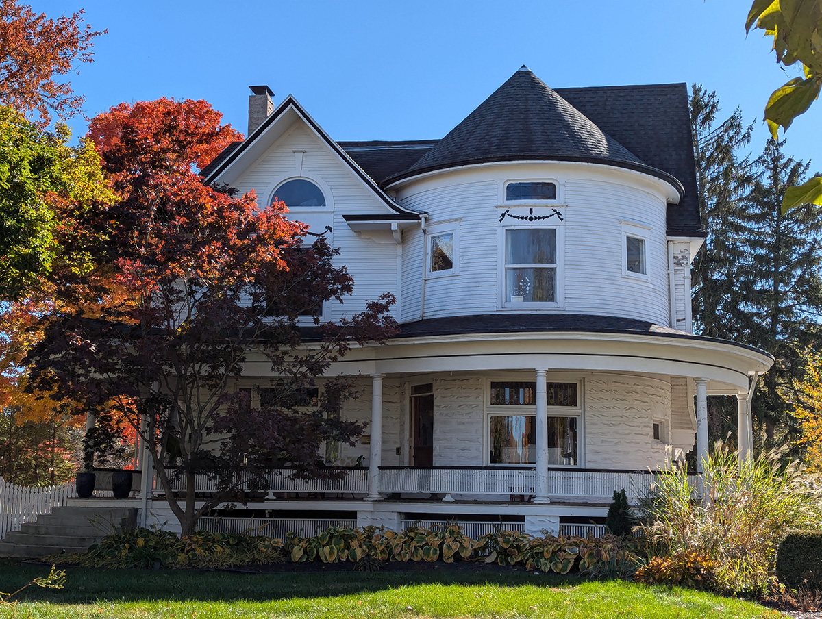
Not because it is huge, though it has presence. Not because it is rare, though houses like this are not being made in any meaningful number anymore. What holds the eye is the way the building handles a corner. The front does not simply face forward. It rounds. It turns. It lets the porch follow the body of the house instead of forcing everything into a flat line.
That round tower is the thing most people would notice first. It reads almost like a silo attached to a house, which is part of its appeal. There is something rural and practical in the shape, even though architecturally it belongs more to the world of Queen Anne and late Victorian domestic design. It gives the house a vertical anchor. It breaks the box. It keeps the whole structure from becoming just another tall white house with a dark roof.
But the tower would not work nearly as well without the porch.
That porch is the real move.
It sweeps around the base of the tower in a way that feels both designed and lived-in. It is not just a porch stuck on the front for decoration. It wraps the house into the yard. It creates shade, depth, and a kind of public pause between the street and the rooms inside. It gives the building a threshold instead of a hard edge.
That is one of the things older houses often understood better than newer ones. The front of a house was not only a wall with a door in it. It was a transition. Yard, walk, steps, porch, door, interior. Each stage mattered. You approached the house gradually. You were received by the building before you were received by the people inside.
This house still has that.
The round porch roof under the tower is especially good. It answers the curve above it instead of ignoring it. The conical roof rises, the porch bends below, and between them the tower becomes the hinge of the whole composition. Everything else plays against that move: the gable to the left, the arched window, the vertical porch columns, the horizontal clapboard siding, the dark roof behind it.
There is a lot going on, but it does not feel random.
That is important, because houses from this general period can sometimes tip into visual noise. Turrets, gables, trims, rails, brackets, shingles, stained glass — pile on enough and the building becomes more costume than architecture. This one seems more restrained. The ornament is there, but it is not screaming. The white siding quiets it down. The porch columns are simple. The roofline has drama without becoming frantic.
It feels like a house caught between eras.
There is Victorian asymmetry in the tower and the massing. There is Queen Anne playfulness in the rounded form and the shifting roofline. But there is also a calmer, more classical instinct in the porch columns and the broad white surfaces. It does not look like a museum piece. It looks like a house that has survived several waves of taste and somehow kept its dignity.
The craftsmanship is easy to overlook because the form is so charming. But a curved wall is not a casual decision. Curved siding, curved porch trim, curved roof edges, windows set into a round face — all of that requires more work than a flat wall. It asks more from the builder, the carpenter, the roofer, the painter, and everyone who has had to maintain it since.
That is part of what makes it human.
The house carries effort on its face.
Not luxury, exactly. Effort. Someone decided the corner should be round. Someone decided the porch should follow it. Someone decided the roof should cap it like that. Then other people had to make those decisions real in wood, glass, shingles, columns, paint, and trim.
That is where the feeling comes from.
Modern construction often tries to erase the hand. Flat planes, simplified elevations, repeatable parts, easy maintenance, fast assembly. There is a logic to that, and not all of it is wrong. But something gets lost when every building is optimized into silence. Houses like this are not silent. They tell you where people had to think.
The tower says: this corner matters.
The porch says: arrival matters.
The windows say: light matters.
The yard says: the house was meant to be seen through leaves, not against a blank backdrop.
Even the autumn setting in the photo helps explain the architecture. The red and gold trees do not hide the house; they frame it. The white siding catches the sun. The dark roof gives the whole thing weight. The lawn gives enough distance for the porch curve and tower roof to read clearly. It is a house designed for seasons, for shadow, for the long view from across the street.
That is maybe the simplest way to describe why it works.
It has a front worth approaching.
Not every house does. Some houses are private boxes. Some are financial instruments with windows. Some are just square footage wearing siding. This one still has the older civic instinct that a house contributes something to the street. It does not merely contain private life. It shapes the public view.
And it does that without being grandiose.
The charm is not in size. It is in the turning. The way the porch bends. The way the tower rises. The way the roof catches the top of it. The way the whole building seems to understand that a corner can be more than a corner.
That is the lesson here. Good architecture does not always need rare materials or monumental scale. Sometimes it is a round room, a wrapped porch, a few honest columns, and enough care to let the building meet the world with grace.
This house has that.
Not perfection.
Presence.