Some Victorians earn a glance. This one earns a U-turn.
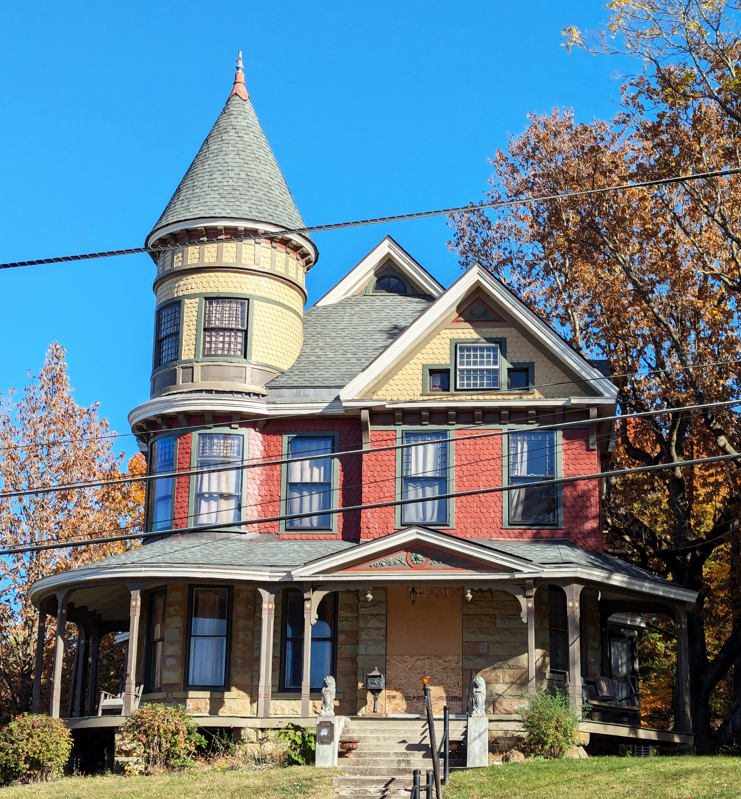
The reason is the turret — a round corner tower rising through both stories in pale butter-yellow fish-scale shingles, banded in trim and capped with a slate cone so steep it reads more witch’s hat than roofline, finished with a finial that catches the last of the afternoon sun. It’s the single decision that turns a big handsome house into a landmark: everything else on the block is competing with a tower.
The rest of the house doesn’t concede the point. Below the tower, the palette shifts to salmon-red scalloped shingles striped with sage trim, wrapping a body built from cross gables set at competing angles — no two rooflines quite agreeing, all of them resolved by a shared gray slate. A half-round window sits high in the central gable like the house kept one eye open on the street.
Underneath it all, the porch does the work of pulling a busy building back down to earth. It runs the full width of the façade and keeps going around both sides, carried on stone piers with turned posts and bracketed corners above — the kind of porch built for people with nowhere better to be. A pair of stone lions stand at the foot of the steps, doing the job lions have always done on porches like this: looking serious about a house that clearly doesn’t take itself too seriously.
What makes it work isn’t any single feature — turrets, wraparound porches, and scalloped shingles are all Queen Anne stock in trade. It’s the discipline underneath the excess. The stone base grounds the color above it. The trim outlines rather than competes. The gables stagger in size so the roofline reads as rhythm, not noise. Take away the paint and the pattern and there’s still a well-proportioned house underneath — the ornament is dressing up good bones, not covering for bad ones.
But discipline is only half the story. The other half is that this house is having fun with it. Queen Anne builders had a whole catalog of moves available and plenty of them chose to play it safer — a single shingle pattern, a quieter two-tone scheme, a tower kept modest so it wouldn’t upstage the rest of the composition. This one didn’t take the safer options. It picked scalloped shingles over plain, a cone over a simpler hip roof, a full wraparound porch over a partial one, lions over urns. Every choice, given the option between restrained and lively, went lively.
That liveliness shows up most in the color. Red and cream aren’t a neutral Victorian default — they’re a costume, chosen and maintained on purpose, generation after generation of owners who could have repainted the whole thing a tasteful gray and didn’t. The green trim isn’t structurally necessary; it’s there because someone decided the windows deserved to be outlined rather than left to blend into the shingles around them. A house can be historically correct without being this cheerful. This one aimed for both.
Set against a stand of maples mid-turn, red and gold leaning into the house’s own red and gold, the effect is almost coordinated, as if the block itself dressed for the occasion. Power lines cut across the photo and the house shrugs them off entirely — nothing about a century-old turret concedes ground to a utility easement.
Which is the whole argument for a house like this. It doesn’t ask to be useful first and beautiful never, and it doesn’t ask to be tasteful first and joyful never either. It insists on being all of it at once — grounded and playful, historically faithful and visibly delighted with itself — on an ordinary Tuesday afternoon, whether anyone’s looking or not. Some houses have curb appeal. This one has personality, and it’s not shy about using it.